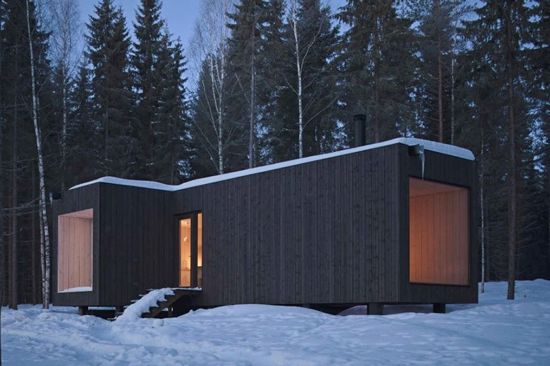
The 5 Key Features of a Minimal House
1. Simple forms and functionality
The layout of the minimal house should be compact, not crowded in any way - in that case, it would remind you of a tiny studio flat. The aim is the conscious arrangement of the small spaces, then the smart furnishing, in order to create the possible largest parts in which light can easily spread making a cozy, positive atmosphere.
In a lot of minimal houses, it is not difficult to notice that instead of vertical spaces, horizontal spaces took more role - so, instead of a large one-floor building, a rather narrow, but leveled design was actualized. The number of square meters won't grow by stacking up the spaced that would be together in a simple, one-floor building, however, it helps the conscious space creating a lot.
2. Materials
In modern architecture, it is indispensable to give enough attention to choose the proper type and quality of the materials being used - and of course, we must take it into consideration in case of a minimal house with extra care.
It is the continuity that is the most prominent feature of the minimal house while looking at it from the outside: the exterior is covered with one kind of material without any pattern or repetition and involving other elements. If a right covering material was chosen, this will grant an immensely elegant, yet homelike and positive look to the minimal house, also reflecting professionality and simplicity.
Last but not least, while the big glass surfaces are increasing the size of the house on the inside, the continuity in material usage does the same on the outisde.

3. Interior & Furnishing
The topic of merging with nature was mentioned before, and we can not emphasize enough how important it is to not to forget the flora in the planning of interior and the arrangement - they have a significant role in making any room or place ', they can breathe life into every grandiose architectural creation.
Are you interested in another architectural style as well? Click to read about Bauhaus!l
4. Smart furnishing
5. Colors
A good option in vitalizing the appearance of a minimal house is the usage of one highlight color, when one side of wall gets a more lively, vivid color than the other sides - or the same with the lower part of the walls. If harmony is a main goal, this highlight color is often the color of the furniture. These are just some basic ideas, there might be a lot more in the mind of architects and designers, let's brainstorm about it!
If white becomes the final color in the end, try equipping your home with colorful textiles (curtains, pillows, rugs, etc.) along with the furniture!
If you want to read even more about the use of color, click and read our former post about the topic!
Have you managed to get inspired? At the webpage of At Home Budapest, you can find several residences where you can turn your ideas into reality!
|
Looking for a new home or an accomodation in Budapest? Reach out to us, At Home Budapest, and we'll be ready to help! Mobile: +36 20 262 7864 Visit our webpage, where you can find 350+ for rent és 500+ for sale real estates! |
|
|

